What do I like in a postage stamp design? This was an interesting question which a friend asked me today when I told him I was working on a blog about postage stamps. So I decided to answer that question with a post on stamp designs I like and dislike.
First which stamps do I like?
I like a stamp to either tell a story or depict a person, object or scene clearly by using a drawing or photograph. To explain this I have decided to use the 1967 - 68 definitive issue, often known as the new decimals.
First the "Primary Industry" set of 1968.

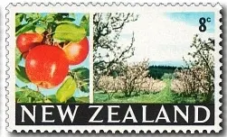

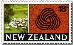


This set of six stamps each depict a primary industry of New Zealand. Each stamp sort of tells a story by showing two pictures of a primary industry. The only stamp I do not particular like is the 18c Wool Industry. You can see the sheep which is good but then the design depicting wool sort of spoils the appearance of the stamp as well as making it different to the other five stamps.
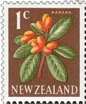
Now our next example are the low values from the main definitive series issued the year before in 1967. These were mainly a re-design of the 1960 definitive series with cent denominations replacing the earlier penny ones.


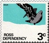
Probably the designs which I dislike the most are sets which do not show clear pictures of their subjects. These stamps are often stylised or too simple in their design having an almost cartoonish appearance. The first example is the 1972 Ross Dependency issue. For a series which has featured some of New Zealand's best stamps this issue in my opinion was a let down.


First which stamps do I like?
I like a stamp to either tell a story or depict a person, object or scene clearly by using a drawing or photograph. To explain this I have decided to use the 1967 - 68 definitive issue, often known as the new decimals.
First the "Primary Industry" set of 1968.


Fishing Industry Fruit Growing Industry.


Timber Industry Wool Industry


Sheep and Beef. Dairy Industry.
This set of six stamps each depict a primary industry of New Zealand. Each stamp sort of tells a story by showing two pictures of a primary industry. The only stamp I do not particular like is the 18c Wool Industry. You can see the sheep which is good but then the design depicting wool sort of spoils the appearance of the stamp as well as making it different to the other five stamps.
Now our next example are the low values from the main definitive series issued the year before in 1967. These were mainly a re-design of the 1960 definitive series with cent denominations replacing the earlier penny ones.


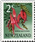
Manuka - ½c Karaka - 1c Kowhai - 2½c Kowhai-kaka - 2c


Puarangi - 3c Matua Tikumu - 4c
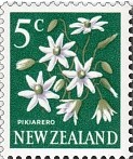


Pikiarero - 5c Koromiko - 6c Rata - 7c
The lower values of the 1967 definitives were native flowers. They are attractive stamps clearly displaying each flower with bright colours. Out of all of them the 5c is probably the least attractive design while the 2½c is my favourite.
Now which stamps do I dislike?Probably the designs which I dislike the most are sets which do not show clear pictures of their subjects. These stamps are often stylised or too simple in their design having an almost cartoonish appearance. The first example is the 1972 Ross Dependency issue. For a series which has featured some of New Zealand's best stamps this issue in my opinion was a let down.


Skua - 3c Air Force Hercules - 4c Shackleton's Hut - 5c

Supply ship HMNZS 'Endeavour' - 8c


Scott Base - 10c Tabular Ice Flow - 18c
Then there is the family issue of 1981 where you can't even see the faces of the people depicted. I like the idea behind these stamps, promoting family values, but the designs just do not attract me to the stamps at all.
1981 Family Life


At Play - 20c Young and Old - 25c At Home - 30c

At Church - 35c
Finally we get to what must be some of New Zealand's worst postage stamps, the 1981 Government Life issue. While these stamps probably did the job they were designed for, after the real lighthouses depicted in earlier issues, in my opinion this set has nothing going for it except bright colours. Another problem is that some of the colours are so dark that the make the text very hard to read. I'm not even going to bother putting a label on them.


Some of the images in this post were used with permission from the illustrated catalogue of StampsNZ
You can visit their web site and On-line Catalogue at, http://stampsnz.com/
Comments
Post a Comment
We appreciate your engagement with our content. To ensure a respectful and constructive community, please take note of the following:
- No Spam, Please: We do not tolerate spammy or promotional comments. Any such comments will be promptly removed.
- Moderation in Place: All comments are moderated to maintain a positive and inclusive environment. Please be patient, as it may take a little time for your comment to appear.
- Sign In with Google: To comment, please sign in using your Google account. This helps us maintain the integrity of our community and allows for better interaction.