
This post is something a bit different. Instead of featuring a set or series of stamps I am going to be looking at only one stamp and an overprint added two years later. So first, lets me introduce you to our stamp. There she is to the right - the '1977 10c QE II.'
Intended as an addition to the 1975 Definitives, the 10c depicting Queen Elizabeth II, was issued in 1977 to meet a demand cause by a change in postal rates. Valued at the new letter postage rate of 10c meant this was a very common and well used stamp.
In 1979 another change in postal rates meant the 10c value was no longer used for ordinary letters so the stamp was overprint with two solid bars over the old value and a new value of "14c." This type of stamp is commonly known as a Provisional.
So that is the basic story of the stamp. One design and value overprint two years later. Since both these stamps were commonly used, large numbers printed and further reprints required. What makes this stamp so interesting is the large number of printing errors which can be found in both the original stamp and in its provisional sister.
The Design.
The design was a simple portrait taken from the 1977 Silver Jubilee Issue which can be seen above. The second photo from the left was used which shows the Queen's facing towards the right, wearing a crown. When you compare this stamp below with the definitive versions you will notice that the Queen's shoulders has been trimmed off, making the picture more square than rectangle.
1977 Silver Jubilee Issue - 8c.
1977 QE II - 10c 1979 QE II Overprint - 14c
Definitive Versions 10c and 14c.
The normal stamp today is listed as $1.30 mint - 50c used.
The normal overprint is valued at 60c mint - 50c used.
The normal stamp today is listed as $1.30 mint - 50c used.
The normal overprint is valued at 60c mint - 50c used.
Errors in the Original Design. (1975 - 1979)
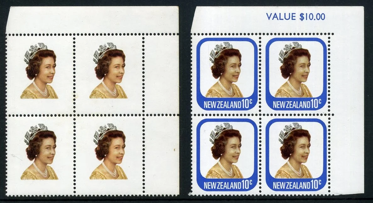
Below are two value blocks, actually the same value block from two different sheets. On the right is a normal example. Notice the value is $10.00 which means there must have been 100 10c stamps in the sheet. The example on the left is the same value block except the blue has been omitted removing both the design border and the sheet value.
During printing extra heavy coating of the blue border caused the blue to offset onto the back of the sheet above as can be seen in the example below. Offset became a big problem two years later during the 14c overprint.
Over inking could also cause problems on the front as well. In this block below we can see all three of the lower stamps have been effected by an ink mark which runs across them. In the third stamp this can be hardly seen but in the first two it is very bad.
Next we will look at colour shifts of the other colours. Some of these are minor while you will find a few are quite spectacular.
Fine colour shift leaving a double edge to her face. Notice how this image makes you blink thinking its your eyes before you realise its the printing.
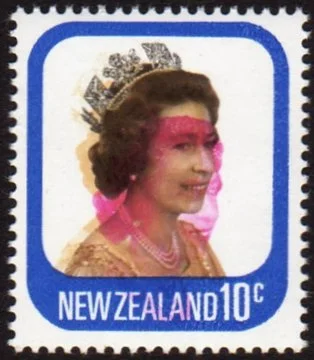
When things really go wrong the result can be quite spectacular. In these cases a crease in the paper caused part of the sheet to end up like this. In both cases there are two colour shifts which make the effect you see above. When you compare these two stamps to the minor colour shift above them you get a clear view of how important the magenta is in this design. The Queens face has become dull, almost a washed-out appearance and the rich brown is lost from her hair.
This final example shows the orange colour omitted.
Originally they were cut using one or more wheels which were rolled across the paper. By the time of this issue the entire sheet was cut at the same time, which meant if one stamp was cut wrong then the other 99 were too.
On the left is a value block from the top right hand corner of the sheet. If you look closely you will see the perforation has made an impression but not broken through the paper. This is know as a blind perforation.
On the right hand block above, the perforation has shifted upwards cutting into the design at the bottom and including some of the stamp above at the top. This would become very noticeable once the stamps are separated.
Two examples of Imperforate Pairs, which have not been perforated at all. The vertical example on the left has a minor colour shift as well which gives a blurring of the image.
In a few cases the error was not found
until after the stamp had been used as seen here.
This example shows a minor colour shift.
Errors in the 1979 Overprint. (1979 - 1985?)
In 1979 the standard postage rate was raised from 10c to 14c. Since there were large stocks of the QE II 10c it was decided to over print them with the new value. This led to an entirely new range of printing errors, both in the printing of the original design and in the over print itself. First we will look at errors in the original stamp before overprinting then we will look at errors in the overprint itself.
In the examples above and below we find various colour shifts during printing of the original design. The one above left is a fine mess caused by three colours misplaced. You could say there was more wrong with it than there was right. To the right above is an smaller colour shift of the red. In the block below left, we have a vertical colour shift of the blue. Notice the blue border is touching the perforations while leaving a white gap under the Queen's portrait. On the right is a larger shift of the red.
Notice that the overprint is out of place on some of these examples too. The above right stamp shows the over print in the correct position making it impossible to read the value underneath. On the example above left the original 10c value can easily be seen. It is similar with the examples below too with the right hand one being correctly placed.
Below is a value block with a large side shift of the magenta. This would be a fine addition to any collection. Nine stamps joined together like this would add to the value of each stamp. On the right hand side is the printers colour tabs by which he can see the colours that have been added to the design. You can see how far the magenta tab has been moved to the right.
This block could be worth as much as $800,00.
Finally we get to errors in the overprint.
Above left the sheet was feed through the machine the opposite way causing the overprint to appear inverted to the top left instead of the intended bottom right.
On the stamp to the top right we find the overprint has become offset on to the back of the stamp above leaving this impression on the gummed back. Blow is a value block of the same problem where even the new sheet value is shown to be offset too.
The in some cases the overprint also got printed twice during printing, in an error known as a double strike. In the example to the left the second strike appears over the Queen's face.
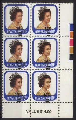
Above is a block of four stamps showing a second strike of the overprint. A single copy of this error is listed by Campbell Paterson at $350.00 to $400.00. This block of four was recently offered for sale at $500.00.
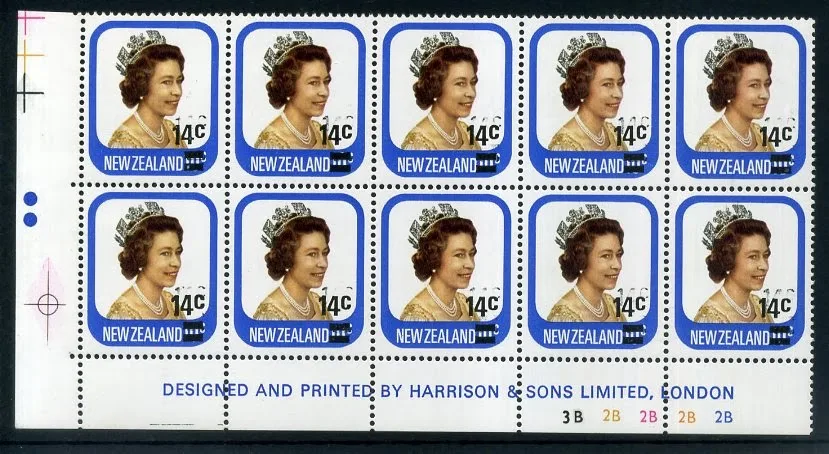
Below is a similar error except the two strikes are now much closer together. What makes this block so interesting is the fact that it is a plate block, complete with the printer's name and plate numbers. Judging by the number of errors in this post, maybe the printer should have left their name off the sheet.
On the plate block above and the value block below you can see marks used during the printing process. In the example above you can see five numbers in different colours below the printers name. These are printing plate numbers so they know which plates were used to produce the printed image. In the example below the printers tabs can be seen. These are used to test for both position and colour. Since the design is made up of a variety of colours over each other a place is required where the true colour of each impression can be seen so tabs like these are added to the margin. This plate block is worth around $500.00.
Here are two examples of shifts in the overprint that are so great that the original value is not been covered at all. The block above was recently offered for sale at $300.00.
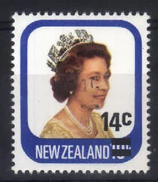
Now this last example is a bit of a mystery. There are five clear
bars to the left of the overprint. For a while I thought this
might be a postal cancel but the stamp appears to be a mint
example. Unsure what caused this. Suggestions would be
welcome.










I did not know there could be so many problems with one little stamp. Is this normal or is this stamp having special problems?
ReplyDeleteI like this blog. It is interesting and colourful. Thank you Allan for telling us about it.
Ayaka.
Thanks Ayaka'
DeleteNo most stamps are not like this one. This was reprinted a few times and in large numbers too. It is also possible someone had a connection with the printing company too.
I'm glad you like this blog and I hope it will help you learn about New Zealand, your new country. Oh and how is the farming going? I hear you have been promoted recently. Good work Ayaka, you deserve it for the hard work you are putting in. Simon and I are following your progress.
Allan.
Thank you Allan
DeleteI like the ones where the pink has moved a lot. They look the most interesting. You can see the Queen's face a bit normal but also see it in the pink as well.
Ayaka.
Hi again Ayaka,
DeleteAn interesting point. Your comment about the pink colour that has given me an idea for some extra notes on this page. But first, let me reply to your comment. The colour is actually magenta. The three primary colours of yellow, blue and red can be mixed together to make almost any colour which is why the printer on your computer uses those three colours.
In the Printing Industry it has been discovered that by useing cyan (a blue/green) magenta and yellow a better result is achieved. You may notice where the magenta has moved the Queens hair has lost its rich brown to become a dull greenish colour.
Please return to this page in a day or so and I will have added more on this to the post above.
Allan
Hi Allan,
DeleteI have discovered your explanation above and found the new notes you have added. Yes these answer my questions very well. Now is it true that stamps that are damaged like these are sometimes worth a lot more money? Why would people pay more for a damaged copy?
Ayaka.
Sorry Ayaka, I missed your comment.
DeleteIt is about rarity. If a stamp is damaged after it was sold then more often it will be worth less but if a stamp was 'damaged' by the printer then it is likely worth more since there will not be very many like them. They are usually known as flaws or varieties rather than 'damaged'.
Since I took so long to reply I've copied this comment to an email for you Ayaka.
Allan
This page is very different to many of your other pages Allan.
ReplyDeleteYes this was an interesting stamp. It is still surprising how many errors were discovered after they had left the printer. Like you mentioned above, this points to problems during printing and poor quality control.
I'd love a few of these in my collection too.
Mary
what value (if any do these stamps have today?) The queen died last year in 2022
ReplyDeleteWe appreciate your engagement with our content. To ensure a respectful and constructive community, please take note of the following:
- No Spam, Please: We do not tolerate spammy or promotional comments. Any such comments will be promptly removed.
- Moderation in Place: All comments are moderated to maintain a positive and inclusive environment. Please be patient, as it may take a little time for your comment to appear.
- Sign In with Google: To comment, please sign in using your Google account. This helps us maintain the integrity of our community and allows for better interaction.