Finding good images of stamp errors can be a problem, but when we come to dealing with image sizes we get into some real problems. Its been decided that in this blog, keeping stamps to scale is not as important as displaying them to their best advantage.
Series Index.
1975 Pictorials - Part One. An overview and history of these issues.
1975 Pictorials - Part Two. The stamp designs and subjects in more detail.
1975 Pictorials - Part Three. Flaws & errors found in the 9 low value roses.
1975 Pictorials - Part Four. Flaws & errors found in the 10c Queen Elizabeth.
1975 Pictorials - Part Five. Flaws & errors found in the higher values.
The 1975 Rose Definitives are well-known for their many printing errors. Some very spectacular colour shifts were discovered among these values. There are also other errors such as perforation shifts, doctor blade errors and clear offsets too. This page must be considered as only a sample of these since in many cases it was 'what do we have to leave out' rather than what can we find to include.
1c - 'Sterling Silver' Rose.
(Normal Example)
1975 1c Rose colour shift of the pink. See the overlap of the greens at the bottom of the design. This is a complete sheet of 100 (50shown) with a close detail view below.
Left-hand - 1975 1c Rose Sterling Silver with red colour shift to the left.
Right-hand - 1975 1c Rose Sterling Silver with red colour shift to the right.
2c - 'Lili Marlene' Rose.
(Normal Example)
Left-hand - A used 1975 2c Rose corner selvage showing sheet value, with minor red colour shift. I love featuring used errors with clear post marks as they prove the error has been overlooked as it made its way through the postal system.
Right-hand - 1975 2c Rose minor red shift creating double branches.
1975 2c Rose selvage pair with the orange frame on the last row weak colour & partially omitted.
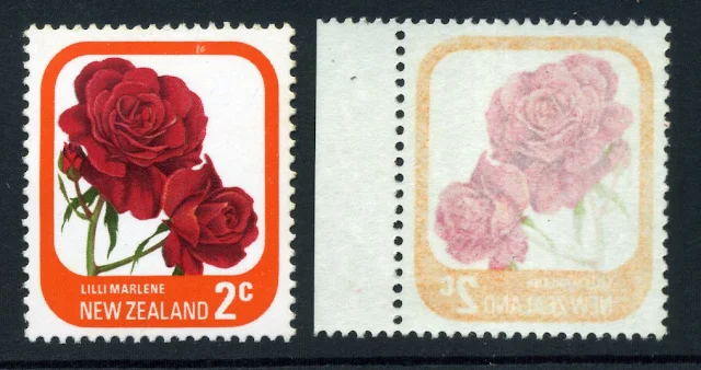
1975 Roses 2c all 4 colours offset on back. Plus normal example for comparison. offsets as good as this are usually hard to find but in this case most of the design can be seen in a mirror image.
3c - 'Queen Elizabeth' Rose.
(Normal Example)
1975 3c Rose major green colour shift upwards, best seen where it doubles the leaves. Looks a bit like a rose in an earthquake.
1975 3c Rose unhinged mint, black colour shift causing distorting & ghosting of the design.
1975 3c Roses corner value 2 pairs imperforated.
Its hard to tell what is going on here as the green and black appear aligned to the left and the blue & red shift appear aligned to the right. My guess is that these items came from the printer's set-up waste as he is bringing the first colours printed in line with the next two colours.
4c - 'Super Star' Rose.
(Normal Example)
1975 4c Super Star Rose selvage block of 10 showing spectacular extra perforations on an angle.
1975 4c rose purple colour shift to the right. This is a great error that really makes you look again to try and figure out what is going on. There is a normal one to compare.
Below is the same error but now on a value block. Notice the movement of the purple
on the printer's colour lines above the sheet value.
Now this stamp must be the star of this page.
The catalogue said "this was a major shift of the purple!" Let's try and figure out what is actually going on here. First thing we notice is the black lines and writing over the printed image telling us this is a used stamp. Yes, someone used it for postage!
1) Next we notice the perforations do not line up with the stamp image so we have a large perforation shift to the right.
2) Next we notice a wide strip of purple on the lower-right edge of the flower. This leads us to realise that the green has moved. See how the green over-laps the purple border on the right while the red seems almost correct further up. So we have a green colour shift to the right.
3) Now this solves most of our problems until we look at the leaves in the top left corner. Compare their positions with the normal one. See the errors now? Both the green and the purple are out of align with the red. So as well as the green shift to the right we have a small red shift to the right. Or is it a small purple shift to the left?
So we have an item that looks very much like it has come from a printer's waste sheet before he has set up and aligned all the colours. But the problem with this it that in spite of being so obvious, its been used. If so then at least one whole sheet was received from the printer so there might have been up to 100 others used too. One other possibility is that we are looking at a fake postal cancelation to make this item more valuable. Either way we have an amazing item!
5c - 'Diamond Jubilee' Rose.
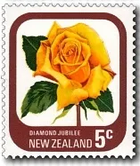
(Normal Example)
Left-hand pair - 1975 5c Diamond Jubilee Rose vertical pair, bright yellow colour shift plus frame brown colour shift. Nice used example as well.
Right-hand stamp - 1975 5c Rose with light green colour shift downwards 0.5mm, creates obvious double leaves and distorts the centre of the rose.
1975 5c Diamond Jubilee Rose, top left hand corner block of 6 with a light green shift to left.
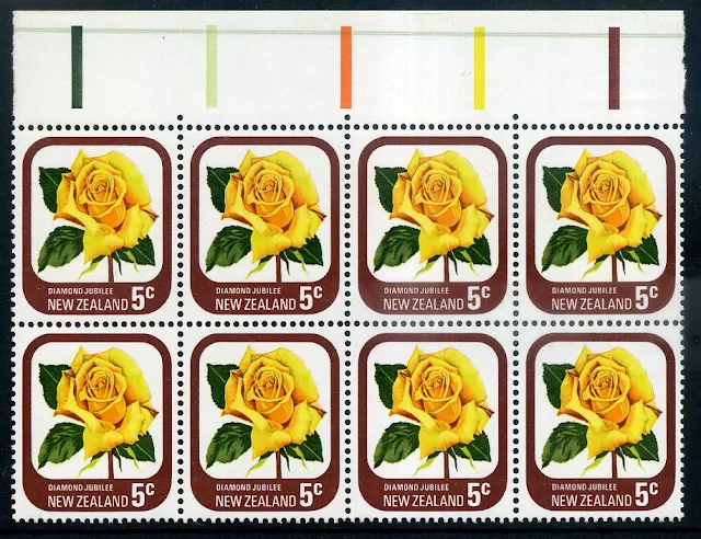
1975 5c Rose top colour Bars selvage block of 8 with green Doctor Blade flaw along top selvage.
6c - 'Cresset' Rose.
(Normal Example)
Left-hand stamp - 1975 6c Rose red shift to the right.
Right-hand stamp - 1975 6c Roses light green colour shift to the left.
In these next two items the pale appearance is image quality. I would not have included them except they both show usually large colour shifts.
Left-hand stamp - 1975 6c Rose with grey black colour shifted 2mm right
Right-hand stamp - 1975 6c Rose major red shift downwards.
The dull colours of these two stamps is due to image quality, not the stamps themselves but considering how big the colour shifts were we thought it worth including them.
1975 6c Rose used block of 10, postal dated 1985, one stamp, 2nd from right in the bottom row, has a smudge mark from a drop of printers cleaner fluid.
7c - 'Michele Meilland' Rose.
(Normal Example)
Shift in the darker orange causes this strange effect.
Left-hand stamp - Downward shift in the lighter orange flower colour best seen where it overlaps the leaves below the rose.
Right-hand stamp - A side shift of the black causes doubling throughout the whole design.
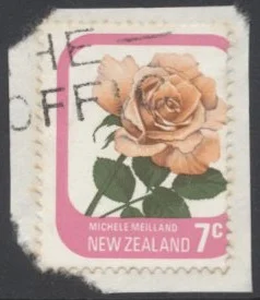
A used example of the lighter orange shift seen above.
Perf shift - down and left. Perf shift - to the left.
Perforation shifts can be seen in the two stamps above. The faint colours of the left-hand stamp is an image problem, not on the actual stamp.
Here is a full plate block showing some very unusual perforation problems involving both doubling and misplaced perfs then by the third column everything seems fine.
Continuing with out theme of perforation problems here are two used examples.
On the left-hand stamp is a misplaced perforation where the right-hand side cuts off part of the design while the left-hand side appears in its correct position.
On the right-hand stamp there is a similar left shift as can be seen above.
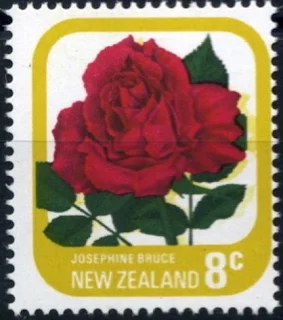
8c - 'Josephine Bruce' Rose.
(Normal Example)
Left-hand stamp - 1975 8c Josephine Bruce Rose, major yellow shift to right
Right-hand stamp - 1975 8c Rose, dark green shift downwards.
Left-hand stamp - 1975 8c Rose, green & red offset on back.
Right-hand stamp - 1975 Rose, yellow partly covers white writing because too much ink was used during printing.
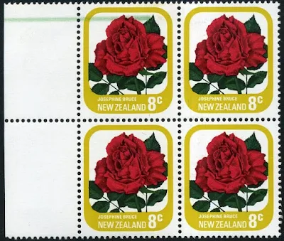
Two doctor blade flaws showing yellow in the selvage of the left-hand block and green across the top stamps of the right-hand block.
9c - 'Iceberg' Rose.
(Normal Example)
The main problem that I was able to find in this stamp was shifts of the green as can be seen in the two stamps above. While this shift can be observed in various parts of the design its best seen where the leaves touch the blue border. This same shift can be seen in the corner block below.














We appreciate your engagement with our content. To ensure a respectful and constructive community, please take note of the following:
- No Spam, Please: We do not tolerate spammy or promotional comments. Any such comments will be promptly removed.
- Moderation in Place: All comments are moderated to maintain a positive and inclusive environment. Please be patient, as it may take a little time for your comment to appear.
- Sign In with Google: To comment, please sign in using your Google account. This helps us maintain the integrity of our community and allows for better interaction.