In 1929, New Zealand began what grew to become our longest running series of postage stamps. These are known as Health Stamps, stamps designed to help promote children's health. Each year, a stamp or set of stamps was issued carrying a surcharge for health to raise funds for children's Health Camps. Finally, in 2017, with dropping sales, the funds raised by these issues had become much less than the cost of designing and printing so it was decided to discontinue the Health Stamp Series.
I have decided to feature this entire set on my blog in large pages so the stamps can be seen as a collection. In some cases, I will also feature certain issues on their own pages and link them to this collection. This is the second part covering the years from 1951 until 1966 before decimal currency began in 1967.
Fast Links


1951 Yachting - 1 1/2d + 1/2d. 1951 Yachting - 2d + 1d.
Date of Issue: 1 November 1951.
Designer: J Berry, Wellington and R S Phillips, Rangiora.
Printer: Bradbury Wilkinson, England.
Process: Recess printed - Intaglio.
Quantities: 1 1/2d - 5.1m.
2d - 6.12m.
The 1951 Health Issue again returned to the theme of sport and outdoor activity. This time a race between the small yachts of the Takapuna Class in a typical coastal scene. The class was chosen for this issue because both crew members had to be under the age of 19.
I see this design as a step back in some ways when compared with those of 1950 and 1952 because the older engraving process was used. I understand this was partly due to the rush to get the design to the printing stage.

Corner Perf on Plate Block.
When this sheet was perforated, the corner was bent over making an extra perf seen in the bottom left corner when the corner unfolded again.


1952 Princess Anne - 1 1/2d + 1/2. 1952 Prince Charles - 2d + 1d.
Date of Issue: 1 October 1952.
Designer: Harrison and Sons, England.
Printer: Harrison and Sons, England.
Process: Photogravure.
Quantities: 1 1/2d - 5.56m.
2d - 6.3m.
Throughout the Health Stamp series can be found stamps featuring members of the royal family, particularly children. The 1952 Health Issue show Queen Elizabeth's two oldest children, Princess Anne and Prince Charles.
Princess Anne.
Princess Anne, Princess Royal, was born on 15 August 1950, the second child of the then Princess Elizabeth (now Queen Elizabeth II) and Prince Philip. I think this stamp does not show the same clarity as that of Prince Charles stamp. Perhaps it is the colour red that lets the design down.
Prince Charles.
Prince Charles Philip Arthur George, The Prince of Wales, was born on 14 November 1948, being the eldest son of the then Princess Elizabeth (now Queen Elizabeth II) and Prince Philip, and is currently heir to the throne of the United Kingdom. For a one colour stamp, this is a good one, nice and clear, a pleasant photograph of the young prince.


1953 Girl Guides - 1 1/2d + 1/2. 1953 Boy Scouts - 2d + 1d.
Date of Issue: 7 October 1953.
Designer: J Berry, Wellington.
Printer: Harrison and Sons, England.
Process: Photogravure.
Quantities: 1 1/2d - 6.93m.
2d - 5.21m.
A new development in the Health Stamp Series saw two different designs used for the 1953 Health Issue, the only different designs before this being portraits of the royal family. The lower value shows girl guides and the upper value shows boy scouts. Signalling is one of the subjects both guides and scouts were taught, so inscriptions in Morse Code were introduced into the designs. The dots and dashes at the top of both stamps represent the word 'Health', down the sides of the 2d + 1d stamp they read 'New Zealand'.


1954 Tramper - 1 1/2d + 1/2d 1954 Tramper - 2d + 1d
Date of Issue: 4 October 1954.
Designer: J Berry, Wellington.
Printer: Bradbury Wilkinson, England.
Process: Recess printed - Intaglio.
Quantities: 1 1/2d - 6.53m.
2d - 4.72m.
A young tramper, with a map in hand, is depicted gazing across Lake Wanaka with a snow-clad Mount Aspiring rising in the distant background. Since Edmond Hillary had just climbed Mt Everest, a view of this mountain was included in the upper left-hand corner.
This design was not so popular as others around this period. It is believed this was partly due to the colours used in the stamps but also due to a change in postal rates which left a smaller demand for these two values. I think this design is a big improvement on the design of the 1937 Climbing Issue.


1955 Medallion - 1 1/2d + 1/2d. 1955 Medallion - 2d + 1d. 1955 Medallion - 3d + 1d.
Date of Issue: 3 October 1955.
Designer: E M Taylor, Wellington.
Printer: Bradbury Wilkinson, England.
Process: Recess printed - Intaglio.
Quantities: 1 1/2d - 2.55m.
2d - 3.57m.
3d - 4.07m.
The 1955 health issue featured three stamps instead of the usual two, with a two colour design and bright 'modern' colours. The King George V Memorial Children's Health Camps Federation submitted this design by Mr E M Taylor of Wellington incorporating a child's head with sprays of kowhai flowers and foliage in the form of a medallion.

Moving Medallion.
An interesting First Day Cover which includes pairs of each value. Notice that the medallion in the centre of the design has moved for each of the three values. I always thought it would be very rare to get more than one colour shift on a single First Day Cover but while putting this Health Stamp collection together I came across a number of them, in this case, more than one shift on a single cover.


1956 Apple Picking - 1 1/2d + 1/2d. 1956 Apple Picking - 2d + 1d.

1956 Apple Picking - 3d + 1d.
Date of Issue: 24 September 1956.
Designer: L.C. Mitchell, Wellington.
Printer: Bradbury Wilkinson, England.
Process: Recess printed - Intaglio.
Quantities: 1 1/2d - 2.09m.
2d - 3.67m.
3d - 3.97m.
The 1956 health issue was again a three value set, this time showing two young children picking apples. The stamp was developed off a photograph taken by Mr J F Louden of Tauranga of his grandchildren at play. While I think the design was clever, I need to admit that three stamps exactly the same with only their values and colours being changed, does not excite me. Maybe a better job of this was made in the 1955 issue above.


1957 Surf Life Saving - 2d +1d. 1957 Sea Bathers, Surf Canoe - 3d + 1d.
Date of Issue: 25 September 1957.
Designer: L C Mitchell and L Cutten.
Printer: Waterlow and Sons, Brussels, Belgium.
Process: Recess printed - Intaglio.
Quantities: 2d - 3.72m.
3d - 3.94m.
The designs for the 1957 Health Issue again featured physical activity outside, this time beach sports of swimming, canoeing and surf life-saving. These designs had been submitted in previous design contests so all the Post Office needed was approval to use them.
It is interesting to notice the bathing costumes worn by the surf life-savers in the lower value. They have straps which come up over their shoulders with much of their bodies covered, unlike the shorts wore today. Although I notice that now most surf lifesavers wear shorts and a yellow club T-shirt when on patrol, to protect themselves from sunburn, be identified by members of the public.


1958 Girls Brigade - 2d + 1d. 1958 Boys Brigade - 3d + 1d.
Date of Issue: 20 August 1958.
Designer: J Berry, Wellington.
Printer: Harrison and Sons, England.
Process: Photogravure.
Quantities: 2d - 3.69m.
3d - 3.56m.
1958 marked the 75th Anniversary of the Boys' Brigade throughout the world. The 3d value shows a boy playing the Bugle with a campsite in the background. The 2d value shows a member of the sister organisation, the Girls' Brigade where a girl in uniform is standing in an archway waiting to join her fellow members in the background.

Light Patch in Green.
On this strip of four stamps, there is a patch of partly omitted green that runs across the top of all four stamps through the values and wording.


1959 Tete (Grey Teal) - 2d + 1d 1959 Poaka (Pied Stilt) - 3d +1d
Date of Issue: 16 September 1959.
Designer: Harrison and Sons, England.
Printer: Harrison and Sons, England.
Process: Photogravure.
Quantities: 2d - 5m.
3d - 4.5m.
1959 saw a change in theme for the Health Stamp Series where the original theme of featuring children, was dropped in favour of designs which would sell because after all, the purpose was still to raise funds for Health Camps, not just show pretty pictures of children. Over the next few years, two native birds would be featured one on each the two values of each issue.
Waterbirds were featured on both stamps in this issue. Tete (Grey Teal) is New Zealand's smallest duck commonly found throughout both main islands. The Poaka (Pied Stilt) is also common through most of New Zealand, being a bird found in areas of shallow water where they wade looking for food. This second stamp is well known for colour shifts during printing.


Legs and Eye Side Shift.
Here we have a spectacular side shift of the red where the bird's eye and legs have moved so far to the left that they no longer even touch the bird's body. It is very rare to see such a large colour shift like this. On the single stamp to the right, the shift, being a lot less appears as if the bird has an extra pair of red legs.

Red Completely Omitted.

3d Poaka Red Shift on First Day Cover.
Notice that this is a different shift to the ones shown above. In this case, the red has moved down as well as to the right where the ones above mainly are just red-shifts to the right. What makes this even more of interest is that it is found on a First Day Cover that has actually been sent through the postal system. Taking note of the name Ashburton on both the cancel and the address it is likely this was a stamp collector sending this cover to himself to collect the postal cancel.

Red Colour Shift.
Here is something very different. It is a printing error in the cover design this time. Looked closely at the colour picture to the left and you will see it has a blurred appearance caused by the red being moved slightly to the right. (You can compare this with the cover above.)
It appears this cover error passed through the postal system, travelling from Wellington to Hastings. Also of interest here is that it appears this letter was posted using an official Government cancel.


1960 Kotare (Sacred Kingfisher) - 2d + 1d 1960 Kereru (Wood Pigeon) - 3d + 1d
Date of Issue: 10 August 1960.
Designer: Bradbury Wilkinson, England.
Printer: Bradbury Wilkinson, England.
Process: Recess printed - Intaglio.
Quantities: 2d - 4.04m.
3d - 3.9m.
The kingfisher is a smaller bird, often found near water. As a boy, I used to watch a pair which would catch bugs and insects off the surface of our swimming pool. It was interesting to watch them dive for their food. Often pools, where goldfish are kept, have to be covered with wire mesh to stop the kingfishers taking the fish.
The wood pigeon was a larger bird prized by the Maori people as a good eating bird. They would set traps in trees to snare this birds. Today, of course, the wood pigeon is protected and its numbers are again increasing.


1961 Kotuku - White Heron - 2d + 1d 1961 Karearea - Bush Hawk - 3d + 1d
Date of Issue: 2 August 1961.
Designer: New Zealand Post Office, Wellington.
Printer: Bradbury Wilkinson, England.
Process: Recess printed - Intaglio.
Quantities: 2d - 5.1m.
3d - 5.1m.
Both birds depicted in the 1961 Health Issue are now becoming rare in New Zealand. First, the 2d value shows the Kotuku (White Heron), a bird usually found in coastal areas and on inland waterways in both the North and South Islands. The 3d value shoes the Karearea (The Bush Hawk), a bird of prey found in open bush areas where smaller birds, insects and animals can be found.


1962 Kakariki (Red-crowned Parakeet) - 2 1/2d + 1d.
1962 Tieke (Saddleback) - 3d + 1d.
Date of Issue: 3 October 1962.
Designer: New Zealand Post Office, Wellington.
Printer: Thomas De La Rue, England.
Process: Photogravure.
Quantities: 2 1/2d - 3.5m.
3d - 3.5m.
The Red-crowned Parakeet is now mainly found on Stewart Island and a few other offshore islands. Sightings of this bird on the mainland are now very rare. Its close cousin the Yellow-crowned Parakeet has managed to do better on the mainland and is much more commonly seen.
The Saddleback, due to introduced predators, has become an endangered species now being found on only a few offshore islands. More recently work has been done on breeding programs and establishing populations on other islands.


Orange Errors During Printing.
On both the stamps above, the printing error occurred during printing the orange colour. On the left-hand stamp, the orange has moved creating a double image effect, best seen around the fruit and branch under the bird. This stamp also shows a major perforation shift with the design being moved up and to the right causing the orange to move off the stamp at the top.
On the right-hand stamp, the orange has been omitted completely leaving a very bland and uninteresting appearance. Again it appears that this stamp is also off centred.
Various Colour Shifts.

In these five used stamps, a variety of colour shifts can be found.


1963 Prince Andrew - 2 1/2d + 1d 1963 Prince Andrew - 3d + 1d
Date of Issue: 7 August 1963.
Designer: Thomas De La Rue, England.
Printer: Thomas De La Rue, England.
Process: Recess printed - Intaglio.
Quantities: 2 1/2d - 3.5m.
3d - 3.5m.
After four years of the bird designs, the Health Camps Federation sought a change for the 1963 issue and suggested that stamps depicting Prince Andrew could be produced. Prince Andrew, Duke of York is the second son of the Queen and Duke of Edinburgh. He was born on February 19th, 1960. Like his brothers and father, Andrew attended Gordonstoun school in Scotland and spent two terms at Lakefield School in Ontario. The two photos were chosen and approved by the Queen who was in New Zealand at the time, they were then converted into the stamp designs we see above.


The Bleeding Finger Flaw. (Plate 1B Row 3 Stamp 5)
A mark on the plate directly over the Prince's finger has created this appearance of a finger which has been bleeding. The issue was printed in sheets of 120 but two different printing plates were used. The flaw only appeared in one location on the second plate so this gives a 1 in 240 chance of finding this flaw. Campbell Paterson's Catalogue values this error at $150.00 mint and $85.00 used copies.
Above are two used examples of this flaw. You will notice a slight difference between them as it appears this flaw changed during the print run.


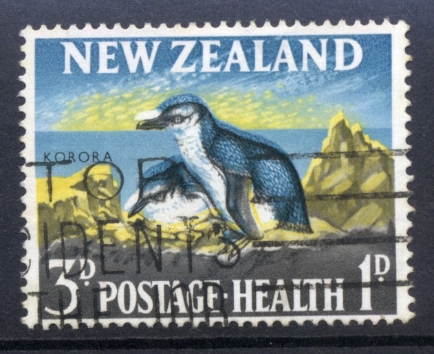
1964 Tarapungas (red billed gulls) - 2 1/2d + 1d.
1964 Korora (blue penguin) - 3d +1d.
Date of Issue: 7 August 1963.
Designer: New Zealand Post Office, Wellington.
Printer: Harrison and Sons, England.
Process: Photogravure.
Quantities: 2 1/2d - 5m.
3d - 5m.
Two more birds from coastal areas appeared in the 1964 Health Issue. First, we have the Tarapunga (Red Billed gull), one of the seagulls found around New Zealand. Then we have the little Korora (Blue Penguin) which is again found in coastal areas.
These two stamps are well known for a large number of printing errors such as colour shifts. I have included some of these below but have seen many others as well.

Four Legged Seagull.
While this side shift of the red is not that large what makes it so interesting is that it creates the impression of the second bird having four legs. This is the kind of error which attracts a lot of interest from collectors and so has become more valuable than other larger colour shifts from this same issue such as the examples below.


Major Red-Shift.
In these examples, the red has shifted so far to the right that the four-legged effect has now been lost.


I really like this one as I've never seen a shift moved so far up like this one has. Also, notice that this stamp has been used as well. On the right-hand stamp, the red has moved in a downwards direction, also something I have never seen before.

Red Omitted.
Yes, it's gone! There is no red at all.

Blue-Shift Upwards.
Now for a change from red-shifts in this stamp, here is a blue-shift.In this case, the blue has moved almost directly up giving the stamp a stretched appearance. This shift is best seen at the line between the land and the ocean where there is now a white gap.

Three Colour Shifts.
Above and below are three examples of colour shifts during the printing of this stamp. In the pair above we can see a colour shift of the dark blue in the left-hand stamp. The right-hand one is a normal one for comparison.
Below we have a movement of the black in the left-hand stamp which has created a very noticeable appearance to the bird on its head and back. The final example on the right-hand side is a colour shift of the yellow which is a lot harder to see. Normally I would not include such an example but I thought it was interesting to have examples three different colour shifts of this one stamp.


1965 Kaka (Parrot) - 3d + 1d. 1965 Piwakawaka (Fantail) - 4d +1d.
Date of Issue: 4 August 1965.
Designer: New Zealand Post Office, Wellington.
Printer: Harrison and Sons, England.
Process: Photogravure.
Quantities: 3d - 5m.
4d - 5m.
The two native birds appearing on the 1965 Health Issue was the native parrot the Kaka, found in the mountains of the South Island, and the cheeky little Fantail which is common all over New Zealand and does well in areas close to humans, as well as in rural and bush areas. Notice that the year appeared on the stamps again, the first time since 1934.


Colour Shifts.
In these more modern stamps, the major problem appears to have been colour shifts which escaped being noticed and removed by the printer. In both of these examples, the brown has shifted creating a double image effect which can be seen around the leaves in the 4d but is particularly noticeable in the 3d.


1966 Bellbird - 3d + 1d. 1966 Weka - 4d + 1d.
Date of Issue: 3 August 1966.
Designer: New Zealand Post Office, Wellington.
Printer: Harrison and Sons, England.
Process: Photogravure.
Quantities: 3d - 5m.
4d - 5m.
In 1966 New Zealand was approaching a major change where the old Sterling Currency would be replaced with Decimal Currency. It would also be a point where the Health Stamp series would change from native birds to sports. The last two birds in this series were the pretty little Bellbird, seen here on the branch of the kowhai tree, and the flightless weka seen among the ferns of the forest floor.

Colour Shift in the Olive.
In both of these used stamps, there has been a colour shift where the olive has been printed lower than the other colours. We talk about the colour moving but in a printing press, the colour image is locked in place, no matter which printing process is used. It is the movement or positioning of the paper which caused the olive image to land in the wrong place.


Two Colour Problems.
Left-hand stamp has the sepia completely omitted. See how much difference this makes when compared to the normal one above.
Right-hand, the background green is very light and patchy giving the whole stamp a blue appearance.


Two Colour Shifts.
Left-hand stamp - the side shift of the back has caused a ghost image to the right of the Weka. Also, notice that the values have shifted to the right as well.
Right-hand Stamp - the background green has shifted up. Best seen along the bird's back.

A drop of printers cleaning fluid landed on the printing plate of the green background colour. The fluid washed off the ink, creating this blank patch for a few impressions before it inked over again.

Perforation errors.
On the 3d Bellbird miniature sheet above, different perf errors can be seen including a treble perf on the left side.
On the block of 4d Weka below, perf errors can be seen in the first column of stamps.

Decimal Currency.
In 1967, New Zealand changed from the old Sterling Currency to a more modern and easier to use Decimal Currency. This seemed like a good place to end this page with the new decimal stamps starting in Health Stamps Part Three.
Back to Health Stamps 1929 - 1950. Forward to Health Stamps 1967 - 1999.
Some of the images and information in this post were used with permission from the illustrated catalogue of StampsNZ
You can visit their website and On-line Catalogue at, http://stampsnz.com/
Some prices on flaws and varieties were quoted from The Campbell Paterson's Loose-leaf Catalogue.
Campbell Paterson Ltd www.cpnzstamps.co.nz
Many of the flaws on this page have been copied from New Zealand Philatelic Brokers Ltd. web site.
Just some background to the first day cover showing Poaka leg side shift. J Gazzard and I were at school together and we had a complete sheet of this error, practically the whole class at Hampstead primary in ashburton put one on a first day cover and posted them to ourselves
ReplyDeleteSo you are saying we've got one of those covers from your class in Ashburton. That is rather neat. We thought it was so good having an error that had obviously gone through the postal system. Then being a First Day Cover was even better. It must have been lucky getting such an error on the first day like that. A whole sheet too.
DeleteMany colour shifts as big as that have most likely come from Printer's waste. It is good to find an error that actually made it all the way through the system.
Thanks for sharing that with us.
Kim.
Sorry readers, I should have mentioned,we are talking about the 1959 Health Issue.
DeleteI have one
ReplyDeleteWhich stamp are you talking about?
DeleteWe appreciate your engagement with our content. To ensure a respectful and constructive community, please take note of the following:
- No Spam, Please: We do not tolerate spammy or promotional comments. Any such comments will be promptly removed.
- Moderation in Place: All comments are moderated to maintain a positive and inclusive environment. Please be patient, as it may take a little time for your comment to appear.
- Sign In with Google: To comment, please sign in using your Google account. This helps us maintain the integrity of our community and allows for better interaction.